Speak on Steem proposal update: Rebranding, Heavy Dark Mode, Search bar and much more

Greetings!
I welcome you today, to this space where we will know everything new in Speak on Steem. Today we bring improvements that will completely change the way you consume video content on Steem, we will take you straight to the future, with a total redesign of our brand and the website, and we will prepare you for the incredible features that are to come.
Speak on Steem has revolutionized the way we create content in Steem, we have opened a world of possibilities to all the communities and projects of the platform to allow the integration of video that communicates in a different and more human way.
Today we are about to make that experience even better, our main focus was to bring an initial version of IPFS to allow the original video content to be possible in the ecosystem, for this, we put all our effort into developing the fundamental elements of the website in record time.
Today, our IPFS node stores more than 50 GB of video uploaded by users. And more than 300 publications a week, already include a video specially created for Steem. The challenges of the future will be to start expanding to external users, and a fundamental part to achieve these goals is appearance.
This report will be divided into two sections, the work done in the graphic design part, and the development work. We are very excited to be able to share today the biggest aesthetic update that Speak on Steem has experienced.
The brand
The success of a brand depends on how recognizable it is in the social collective, the design of an easy-to-replay symbol, with well-defined colors and striking shapes, are aspects to consider when achieving this goal. The redesign of the logo consisted of trying to build a symbol using characteristic elements of the project.
As a first step we collect all the relevant information and develop simple symbols that will be linked to the project, in addition, we compare these elements with graphic elements of competent brands, then the results obtained. We also evaluated certain colors, since the previous palette had little visual weight; the objective was to use a modern and electric color, which made good contrast with dark backgrounds.

Graphic elements before creating the logo.
Playing a little with the shapes and concepts we developed several simple icons that include the eye of the visitors, sound waves, and the Play triangle. Taking these graphic elements into account, we begin to create different proposals to evaluate their functionality and development of the implicit concept.

Symbolic proposals discarded.
Having a fairly defined symbology. The next step was to try to combine them that looked good and above all that it will work in web format, the previous proposals had an interesting concept development, but their functionality on the site was low. The idea of the symbol is to represent the content visualization with the Play button, initially we used the sound waves as part of the symbol, but we realized that this was overloading the design.
After several tests, we developed a much cleaner and more functional symbol, having quite thick and striking elements that work perfectly in the small versions widely used on the web. This was the result:

Speak on Stem Icon.
With this quite acceptable result, we proceeded to create the universe and iconographic of the brand, in order to have different versions that work in different scenarios.

Universe graphic icon.
We also develop versions that implement the project name for a perfect logo for reproduction in social media content and printed advertising material.

Logos.
The logo makes use of the Nunito Sans font, a free-to-use font present in Google Fonts. Correctly defining these rules and colors is essential for the development of a functional and striking design. The next step was to develop a sketch of the user interface to be able to proceed with the development, we used Figma as professional editing software for this work.

Enhancing Speak on Steem
%2012.08.37%E2%80%AFa.%C2%A0m..png)
Speak on Steem turns Heavy Dark!
Dark mode is a feature that has become a trend in recent years. Most platforms and operating systems today offer a dark mode allowing users to choose between a clear interface or an interface where black predominates. This, in addition to the customization it offers, also has multiple benefits such as reducing eye fatigue when spending time looking at the screen, reducing energy consumption, improving the battery life of users' devices and protecting OLED screens from burnt pixels.
At least 49% of the global population prefer dark mode compared to 18% who prefer light mode according to TeamViewer. The trend is clear, that's why we have decided to make the dark theme, the default theme of the users of the platform, however, this can be reversed, in a clear way if the user wishes.
%2012.08.17%E2%80%AFa.%C2%A0m..png) | |
|---|
Shine Mode vs Heavy Dark Mode.
This is how both interfaces are seen, which can be chosen by each user, thus allowing to further customize the experience of using the website. Next we will review in more detail the changes that the entire interface has undergone.

Post cards.
The preview of the publication is essential for other people to decide to enter it and see your content, we focus on redesigning the preview cards to the maximum to prioritize the most important and offer key content that makes more people enter your publication. A modern card inspired by very successful platforms such as YouTube, but empowered with the benefits of Web3.
 |  |
|---|
Video card effects.
Always visible rewards, effects before reproduction, reorganization of information, visual and hierarchical order and identifying labels of the type of content were the specific modifications made to the publication cards. A fundamental feature that will help curators is the identifying label of the type of content that will help you distinguish content. IPFS from YouTube, and normal Blogs.

Sidebar, Navbar, and carousel.
The next things we will talk about will be the upper sector of the site that was improved to adapt to the new design philosophy. The advertising carousel. Now it uses rounded edges and does not occupy the entire screen as it did at the beginning. The Navbar includes the new logo, improvements in the buttons for viewing them, the button to switch the light and dark mode and a search bar that will allow you to find your favorite authors or video content.

Search Bar in action.
For example, if we look for "How to" all the videos will appear, which in their title or body have this combination, which will make finding tutorials and useful content especially easy.

Search Bar in action.
You can also find your favorite users, writing a username that is close to the original username of the person you are looking for, it does not need to be 100% the same, just have certain similarities and you will have results with the matches closest to your search.

User profile.
We have considerably improved the profile of the users achieving a modern and fairly complete aesthetic, we have improved the navigation menu to make it more striking and less inclusive, we added the cover photo and organized the profile information a little.
With this aesthetic we can compete with modern platforms, based on social content, a network design, quite important that will make the interaction much more friendly and effective.
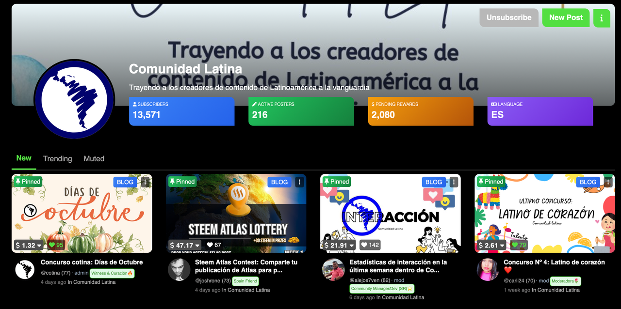
Communities.
The communities also followed the same path, implementing the cover photo, relocating the action buttons and highlighting in very striking colors the relevant information of the community, such as subscribers, pending rewards and language.

Video Player
The video player has also taken considerable improvements that make it easier for viewers to interact with a content. More striking buttons important information available, for IPFS content we have a tool in the upper right corner that allows us to change the GATEWAY if it fails.
Other areas of the website have also been improved, to improve the usability and fluidity of it, spaces, aggregate, elements, modified, site navigation resources have been optimized to follow a uniform and modern design pattern.
We have enabled the BETA subdomain of the project to upload changes more frequently and test them together with the community, this will also allow us to maintain more direct contact with people interested in the project.
The BETAS will be published here:
In the same way, the main and stable website will be published at the usual web address:
Here you have it, important changes in the design that will allow us to prepare for the future and will be the vanguard of video content creators who decide to use web 3 as their home. We are very proud of everything we have achieved today and we will continue working for you.
Thank you for joining us today and happy start of the week to everyone.
Amigo Alejo veo que este gran equipo de Steemvideo se tomaron el tiempo para crear un nuevo diseño que capte la atencion de quienes visitamos de vez en cuando esa comunidad aunque no hayamos creado todavia contenido en ella.
Me encanto esa elección de colocar fondo negro eso ayuda mucho a que se vusualice y resalte mas el contenido de cada participante ademas de proteger nuestra vista, yo la uso mucho en mi teléfono para otras aplicaciones.
Espero algún dia aprender a montar videos y colocar mi contenido alli.
Gracias por siempre hacer mejoras en la plataforma...
0.00 SBD,
9.40 STEEM,
9.40 SP
Wow, this is a very clean graphics and how neat the final product came out. With my interest in graphics design, I was already waiting to see how the graphic elements will turn out to be a good logo.
The lemon and black color is just a perfect fit for this layout. Speem is going higher each day and for real it will attract web2 video content creators to web3, I love the layout it how now.
Can't wait to see this new layout😊
0.00 SBD,
7.83 STEEM,
7.83 SP
Hola alejo
No soy de hacer video, pero si he visitado la página steem.video, y de verdad estás actualizaciones están super genial, el lado oscuro de la página me encanta.
Tú siempre con tu equipo de trabajo haciendo grandes mejoras para que el.usuario se sienta más cómodo
Saludos ☺️
0.00 SBD,
7.13 STEEM,
7.13 SP
La experiencia es increíble, me encantó compartir contenido a través de video usando SPEEM y lo recomiendo, como menciona alejos7ven es una manera distinta de crear contenido y repetiré la experiencia, claro que sí 😀👍
0.00 SBD,
7.03 STEEM,
7.03 SP
Felicidades 🥳 ya tenemos por fin 😌 el nombre de la interfaz.
Que bueno que tengas esas dos maneras 😉 para subir nuestro vídeos como opción.
Hoy 05/10/2025
Lo intente subir y lo único que puedo sugerir
Es que sería bueno el vídeo quedará arriba o el medio
Para una mejor estética en blog.
del resto todo bien.
0.00 SBD,
6.98 STEEM,
6.98 SP
Esta actualización es genial. El nuevo diseño, el logotipo y el modo oscuro son muy modernos. Se nota el esfuerzo del equipo. Speak on Steem ha alcanzado un nuevo nivel.
0.00 SBD,
6.79 STEEM,
6.79 SP
Proud to have it done finally👌🏼🔥
#steemvideo to the moon
0.00 SBD,
5.57 STEEM,
5.57 SP
Que buena se ve la pagina, ha quedado muy llamativa, me guata mucho este nuevo diseño y la posibilidad de cambiar al modo oscuro. Los felicito!! Se ve que le ponen ganas a Speem, creo que estas mejoras traeran mayor cantidad de videos.
Algo que por ahi estaria bueno es hacer algunos concursos en videos, algo como por ejemplo, concurso mostrando una plaza y narrando una breve historia del lugar, pueden hacer con distintos lugares. Hacer reviews, hacer promocion a speem o steemit. Tambien puede ser a la cantidad de vistas del video que suben. Bueno, son algunas ideas.
Saludos y sigamos creciendo juntos!!
0.00 SBD,
5.21 STEEM,
5.21 SP
Gracias por tus ideas, pronto se vienen nuevas actividades!!
Excelente trabajo como siempre buscando las mejoras e innovando para ofrecernos una plataforma más moderna, visualmente más atractiva, funcional y competitiva frente a otras interfaces, no solo veremos unas mejoras en lo estético que también es muy importante sino en usabilidad.
Me encantó también que podemos usar la interfaz clara y la oscura que nos ayuda a cuidar un poco la vista, ya que como todos sabemos la luz de la pantalla a veces nos acasiona resequedad en la vista.
Les envío un abrazo 🤗. Éxitos y bendiciones.
0.00 SBD,
5.19 STEEM,
5.19 SP
🚀 Vamos volando una interfaz nueva y muy fresca, en el logo base se define muy bien cual es la intención de la app web y deforma continua desde el inicio vemos el constante avance en cuanto a la facilidad y comodidad para la creación, edición e interacción con todo el contenido, el refrescar la imagen le da un nuevo giro y ademas el soporte es muy rápido y con buenas respuestas sin mas que decir espero seguir viendo el crecimiento y acogida de la app mil bendiciones 🔥👨💻
0.00 SBD,
5.17 STEEM,
5.17 SP