Learn To Paint Still-Life With - (Fruit Composition 2).
Good Day Steemians and Art Lovers, 😎
As I did took my time to think through the patterns and the most understandable way to share and grasp these lessons, I've decided to just limit the objects to little in sizes and amount just to make sure the composition encourages almost anyone to make attempts and see and live through their artistic self.
It's just so annoying how my Internet provider doesn't allow me to access some sites with glitches, sometimes I just open steemit and I can't see the images but the words that makes up the post, I know steemit does have these issues sometimes but my network does a many funny things too, I ought to have shared this very post about 10 hours ago but I couldn't due to my phone network.
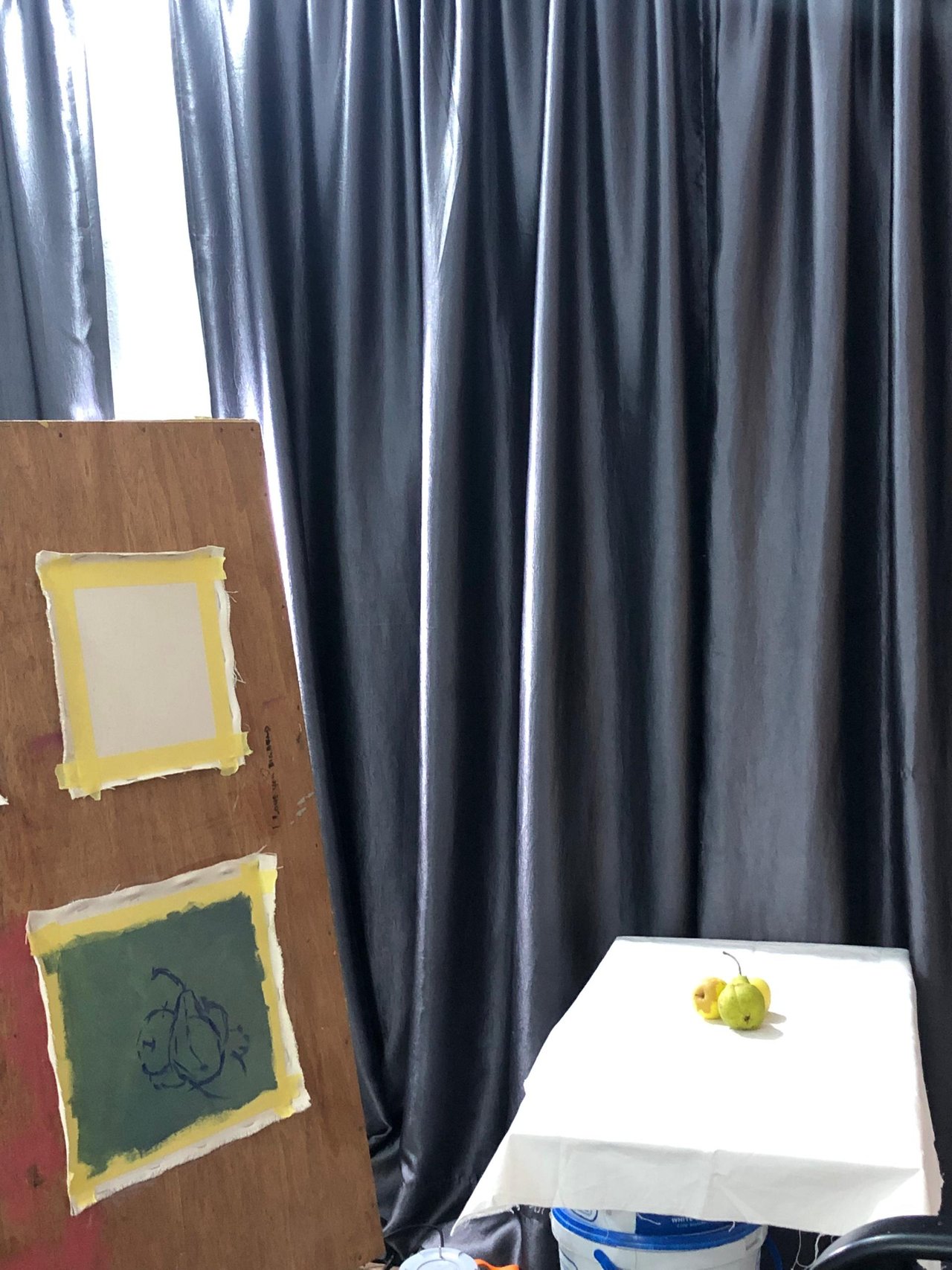
THE SETUP!

Firstly, I would love to say that I really enjoyed this particular artistic study. I got two piece of Apples and a Guava fruit and I thought to study the shapes and the colourful relationship from green to lemon and yellow pallete on the fruit.
As you can see in the image above, aside from the preparations of my canvas, the arrangement of the fruit is another important thing, I had to make sure the arrangements is not boring and at the same time it doesn't takes away the true identity of the subject I am trying to study.

This was the very first stage I had to stare at the fruits long enough to understand and register their shape in my head.
At this stage, I covered my canvas surface with a gray colour and then used a darker colour with a brush to make the drawings of the fruits on the canvas, the way I saw them arranged.

Studying the behaviour of light and how light interacts with these fruits, I decided to paint out the shadows of the fruits first and then started painting the fruit using the darkest colour I have decided to be used on the fruit.

You know have already have my fruits drawn in a very nice shape, now what I did to this point is building up my colours from the darkest areas to the lightest, considering where the light on the fruit is coming from, so my colours would go from the darkest which is quite hidden from the light source to the lightest which is very much accommodating the heaviness and the illuminating effects of the light.

I decided to brighten up my background and foreground in order to create a sense of harmony in the piece and the accommodate the illuminating effects of the light on the surface that serves as the base for the fruits.

And we're practically done here!
MATERIALS.
- Canvas
- Glue
- Primer
- Board
- Easel/Donkey
- Light
Kindly share your thoughts, questions, suggestions and contributions as comments below, I'll be glad to read and reply them all, thanks.
@joslud @weisser-rabe @wakeupkitty
Upvoted! Thank you for supporting witness @jswit.