RE: Logo Design for Valetudo - Contribution to an Open-Source Project #1
Hello @newfinal100.png,
Your logo looks sleek, clean, and professional, with good variety for different backdrops. Well done.
The conversation you link to has great information about the process. It would have been good to see those design decisions incorporated into your post as well. The back-forth and diversity in the initial design set you offered is great, as is how you incorporated the owner's suggestions.
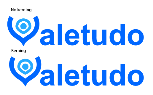
One step further with the logo could have been to kern the "V" to make it more clear that it's part of the word:

Overall, excellent work. Thanks for contributing to utopian, we hope to see more of your contributions to open source projects!
Your contribution has been evaluated according to Utopian policies and guidelines, as well as a predefined set of questions pertaining to the category.
To view those questions and the relevant answers related to your post, click here.
Need help? Chat with us on Discord.
Hello @gutenmorganism,
Thanks for your review, I really appreciate it!
And yes, you're right, it does look better with kerning, will keep that in mind for future designs similar to this one :)
Thank you for your review, @gutenmorganism! Keep up the good work!