Digital Art: The meaning of light and value of a character of Dragon

Hello my dear Steemians,
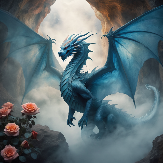
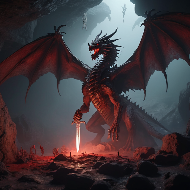
In art a lot depend on character that we decide to create but also the whole scenery can act as something good, positive or dark and mysterious when we decide to apply some colours. Light colours were always very positive, airy on other hand when we use, dark, red or black then this is then look like bad and agressive.
As an example here are two different versions. Which one is looking better for you? The blue one actually look like frozen one, who knows maybe someone had freeze it, but only because of the lively roses it is clear that the dragon is alive, maybe also fascinated by seeing the roses.


You did that with Midjourney? Both of them are good and i see you used prompts to make the drake look more like a painting.
🌟 Stunning work! I love how you’ve shown the power of light and color in shaping a character’s mood. The blue version really gives a frozen, mystical feeling, while the darker tones make the dragon look more powerful and intense. Both versions tell a different story — and that’s the real beauty of your art. 🔥🐉🌹